Monday, October 31, 2016

Fast and Slow Shutter Speed Images


Fast Shutter Speed

The image above uses a shutter speed of 1/125 in order to create a smooth look throughout the image. If you'll notice with the other two photos below, the backgrounds, as well as the child in the foreground, change qualities as I play around with the shutter speeds.

Medium Shutter Speed

The medium shutter speed image uses a 1/20 shutter speed, creating a mildly blurry photo with the slight effect of movement. In some situations, this effect can look aesthetically pleasing to the eye, in other or most situations, this effect can look unprofessional and can result in a poor-looking photo. 


Slow Shutter Speed

This slow shutter speed image uses a 1/13 shutter speed and makes the image look very much in motion. This effect can look good in certain photos where you would want that feeling of movement, like wanting to show the movement in a moving car. The execution of this effect can be difficult, and requires you to be very careful with how much blur you use.

Examples

Here are some examples of fast shutter speed images.


Below are some examples of slow shutter speed images.


Friday, October 21, 2016

Emo

This is just an emo graphic I did a couple days ago. I just wanted to save this here so I could get it on my other devices without having to use a USB. I might later, but, meh. OKay, Buh-bye.


Final Logos


The following images are the final samples of logos for "Literary Baby Printing Co.", formerly known as "The Literary Baby Child Printing Co." 
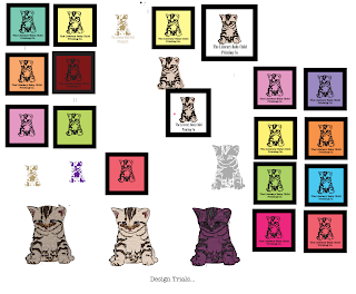


 Rough Designs


 Rough Combined


     For the basic outline of my logo, I decided to use a cat, because I find they represent my Company by being small and investigative. This relates to my company because when I am requested to do a printing job, I always look into the company and print their business cards the way their company should be represented. Thus we are investigative. 
     We are small like kittens because we are a small company. But like any kitten, we are growing into a big and successful...Cat.


 Rough Typographies


     My company, Literary Baby Printing Co., is a printing company that works in the printing and editing of business flyers, business cards, lawn-signs, and much more! Experienced in the latest project-printing technology, we at Literary Baby Printing Co. print out professional-looking design prints that the customers design themselves, in-(metaphorical)-store.

     My company appeals to small businesses, as my own, who have a similar ambitions in the business world. Those ambitions being having a successful career, and to help people with their companies.

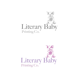
Final Logos, B&W, Full colour


     While creating a logo on Illustrator, I ran into a few minor setbacks. While creating a full colour, semi-realism-based cat, I had trouble with finding certain colours around the face to use in specific areas of the drawing. I tried to figure out which colours would look best out of the many colours I could use from the pixels making up the base photo of the cat. I overcame this obstacle in the design process by using the most representable colours for the fur or eyes of the cat.

     When it came to the logo itself, aside from the original image, I had a huge problem with choosing a colour, as you may have read in my last post. I eventually compared my chosen colours, and gave up completely with all of them. I then created a new scheme of colours, and for a while had a 'dark cream' colour, almost a gold hue. 

     After some deliberation and final product sketches, I decided to use a lavender colour, as seen in the image above. I chose this colour because I found it represented my company's calm, but strong personality. The colour lavender is calming, and so I want people to be care-free and calm when they create their own design prints.  

I learned through this project, and through the design process, how different colours trigger different emotions in people. I also learned the significance of object-placement in a logo. As it turns out, balance affects how people look at your logo or design, and can affect if they want to do business with your company. Now that I think about this, it seemed obvious that the placement of certain objects would affect everything. 

Overall, this was a fun project, and I enjoyed creating a logo. 


Thursday, October 13, 2016

Opinions Needed!

I am currently creating a logo, and have decided on a basic outline for The Literary Baby Child Printing Co.'s logo.

But... I am divided on which colour. I have created examples of considerable colours, and need the people's opinions on which one I should use as the 'Official' Literary Baby Printing Co logo colour.

Here they are...


Write in the comments which one you think should represent the company. If you have any other logo colours to suggest, please also leave it in the comments!

Thank you! ( . _ . ; )

Wednesday, October 12, 2016

Vectors vs. Rasters


The difference between Vectors and Rasters...


Vectors: Vectors are basically clean, dynamic lines. You would typically use vectors in graphic designs like logos or posters, where you need more organized, less graded looking lines to make the entire picture look cleaner. 
Some advantages of vector images are the cleanliness and precision of the lines. They can also be resized easily without changing the picture quality. Vectors can also be converted easily to rasters to give the images more depth. 


Rasters: Rasters are lines that look more graded. Raster images are made up of microscopic pixels that give each image its faded colours. You would use these types of lines for more realistic drawings and artwork. These lines can be used to easily to fade colours and give pictures depth.
A few advantages of rasters are for editing images, giving them a continuous deep colour tone. Rasters are also good for complex images, and it gives them a more detailed look, making them look more realistic. 


That is the difference between rasters and vectors, along with some examples and advantages.


(Information: http://vector-conversions.com/vectorizing/raster_vs_vector.html)

Thursday, October 6, 2016

Selected Photography (Assignment)


I chose the traits 'literary, small, and investigative', because I like to use intriguing words, I am small but I am productive,  <(>o< ), and I will always look into my projects to get a deeper insight on my clients and their passions.
My business is 'The Literary Baby Child Printing Co.', and I am in the business of printing professional-looking flyers for a variety of clients from small businesses to  block-party advertisements.

These are Cats!

That is all.